How Fujifilm Classic Negative and Classic Chrome Look
Classic Chrome and Classic Negative have some big differences.
We took a look at what you folks were typing into our search engines. Apparently, many of you are curious about the differences between Classic Chrome and Classic Negative with Fujifilm cameras. So we headed into our archives of Fujifilm GFX 50R photos. These images were rendered in Classic Chrome and Classic Negative. Let’s talk about some of the differences.
Classic Chrome
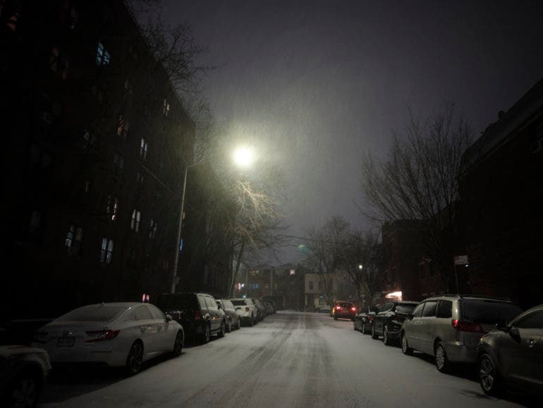
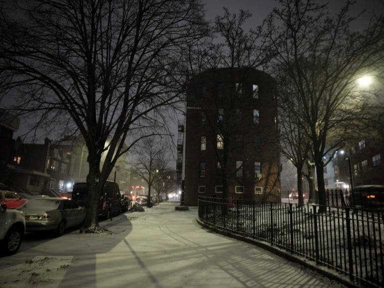
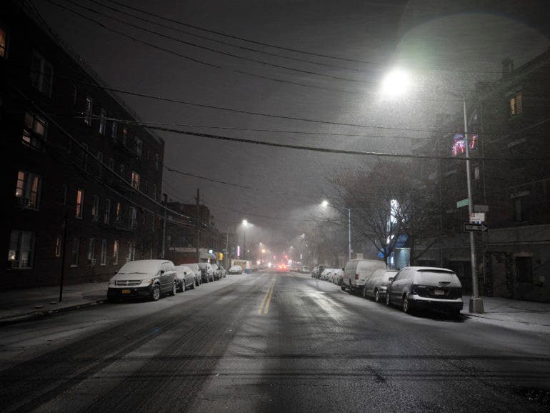

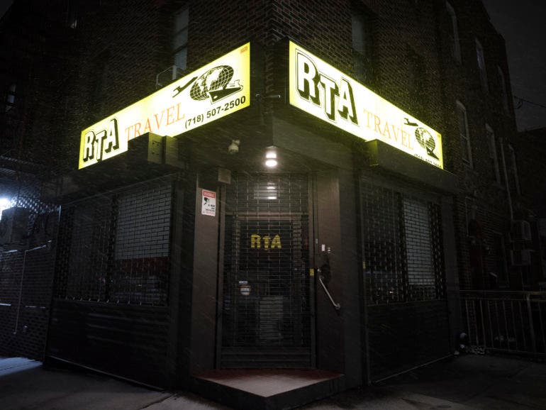


Classic Chrome has a cooler and more vivid look in some ways. Certain color tones are a bit less saturated. The images above were shot on the GFX 50R. The photos below were on the XT2. It’s a bit hard to describe. Both provide lots of detail in the highlights and shadows. The shadows are lighter with Classic Chrome. (In my mind, it’s always been Fujifilm’s most difficult simulation to use.) With Astia, Provia, and Velvia, you can expect something specific. With Pro Negative, you’ll get some variant of the other three. But, there’s nothing like Classic Chrome on the market. The photos are hit or miss, but when they’re on point, they’re some of the best you’ll ever see.
Chrome film was designed to be shot during the day or with a lot of light. It was also very low ISO. But in my tests, I’ve shot with it at ISO 1600 and above, and I loved the render. You can’t really put a finger on it, but no matter what, give it around a stop extra of light.













Classic Chrome doesn’t necessarily lend itself to any specific genre. But we’ve done some really cool stuff with it and photographing animals before.
Classic Negative
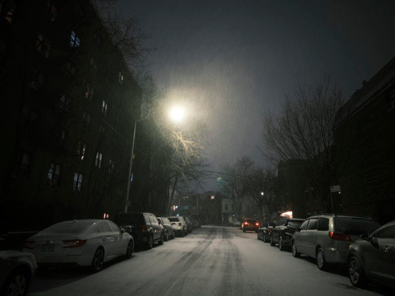
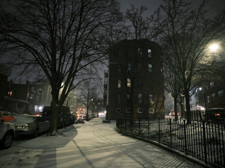
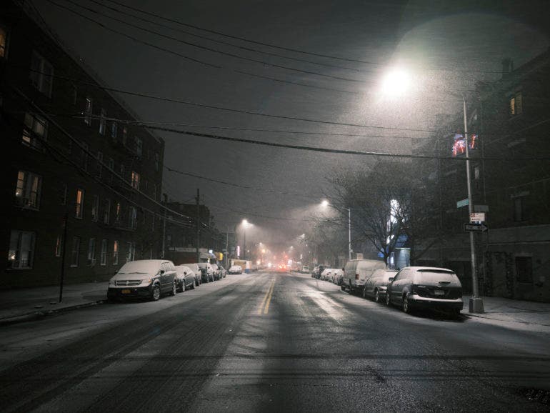

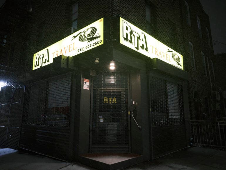
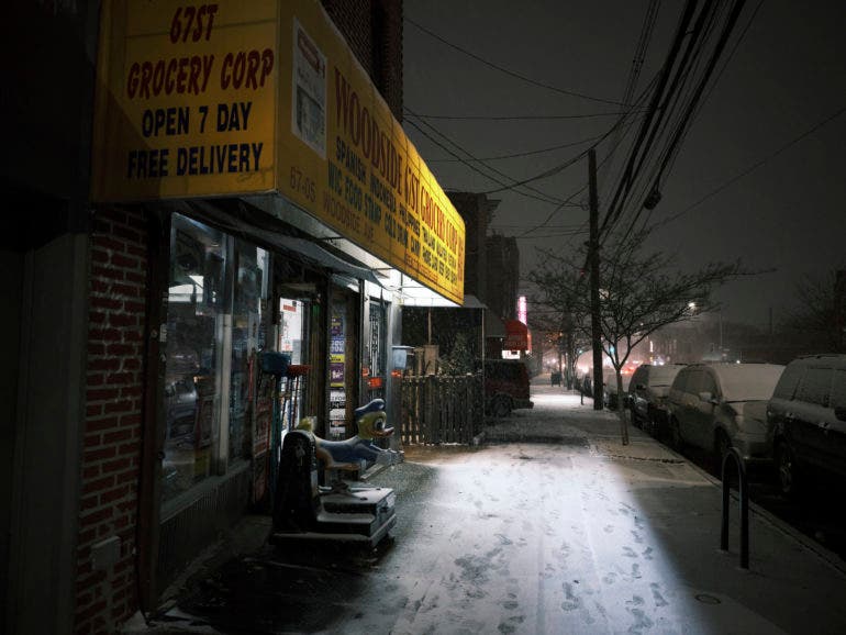

Personally, Classic Negative is very easy to use. It’s always got a warmer feeling to it with auto white balance settings on. Even when you lock it, the images are going to feel somewhat more warm and purple. It likes to be overexposed or to have a lot of light. When there isn’t a lot of light, it reacts oddly. Classic Negative is sort of temperamental. Again, you want to give it a lot of light. But that doesn’t mean that you expose each scene the same way.
Classic Negative also naturally has a softer look to it. It’s easy to enjoy the render and it sincerely looks like an actual film emulsion.












We’ve used Classic Negative a lot with portraiture and street. It’s fun. And more specifically, it’s a look only Fujifilm has. It’s very sought after in the wedding and portrait photography worlds. Folks really enjoy it!
So which one do you use when? Truthfully, that’s tough to figure out. Part of the reason is because they look so different based on the exposures and the available light. Color Negative can take on a very pastel look when you overexpose it, and that’s how Classic Negative behaves. Classic Chrome is more or less the same throughout. It also likes a bit more light, but the way it renders it is more chaotic. It doesn’t render like the actual Velvia film at all, and it’s nothing like shooting with Kodak Ektachrome.